

Picking a neutral paint color sounds simple until every sample looks different once it hits the wall. The real trick is knowing which shades work with your lighting, furniture, and everyday life instead of chasing whatever is trending.
These practical paint hacks can help you choose timeless neutrals with more confidence. From warm whites to rich moody tones, each tip reveals a simple way to get a polished designer look without second guessing every paint chip.
Let Lighting Pick the Winner
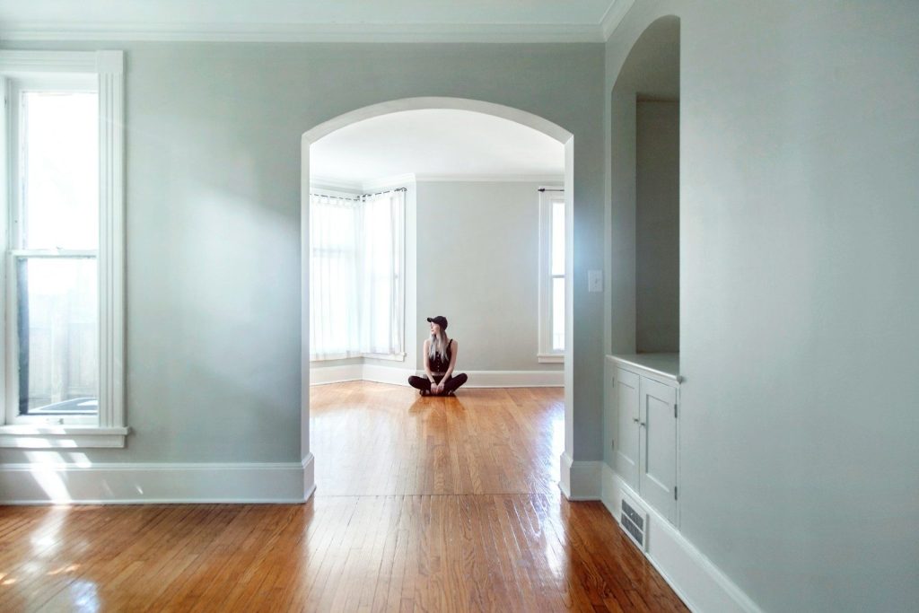
Natural and artificial light can completely change the same paint color throughout the day. A shade that feels creamy in the morning may appear cooler by evening, so always view samples at different times before making a final decision.
Testing several large swatches instead of tiny chips makes undertones easier to spot. This quick step helps you avoid expensive repainting while making sure the color stays appealing in every corner of the room.
Match Warm Walls With Warm Decor
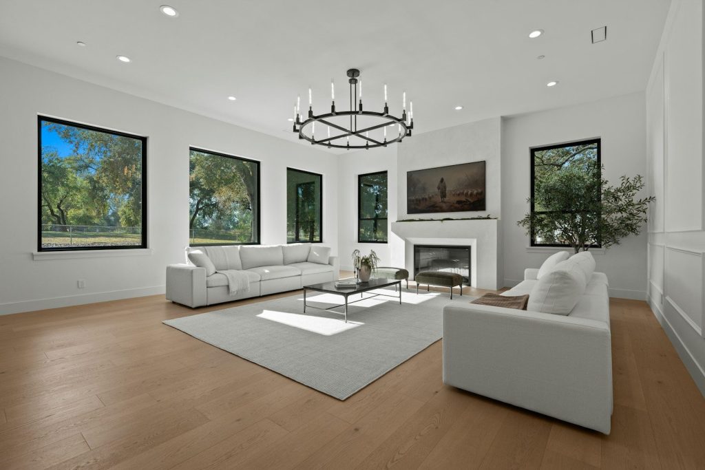
If your home features wood floors, tan furniture, or brass finishes, lean toward warm neutrals instead of icy whites. The entire room feels more balanced because the colors naturally support one another.
Soft shades like Swiss Coffee or White Dove often create a welcoming backdrop without feeling yellow. They deliver comfort while still looking clean and fresh in most spaces.
Use Cool Neutrals to Open Small Spaces
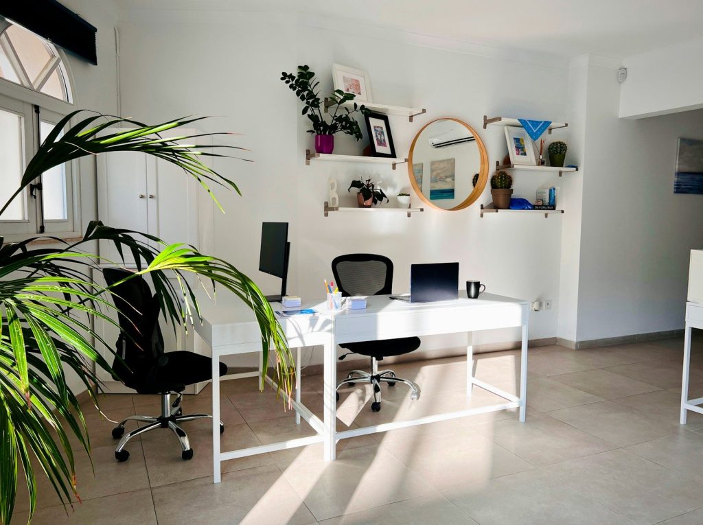
Rooms that feel cramped often benefit from cooler grays or whites with subtle blue or green undertones. These shades reflect light differently and can make walls seem farther apart.
This trick works especially well in home offices, bathrooms, or narrow hallways where you want an airy atmosphere without relying on bright white paint.
Do Not Fear a Deep Neutral
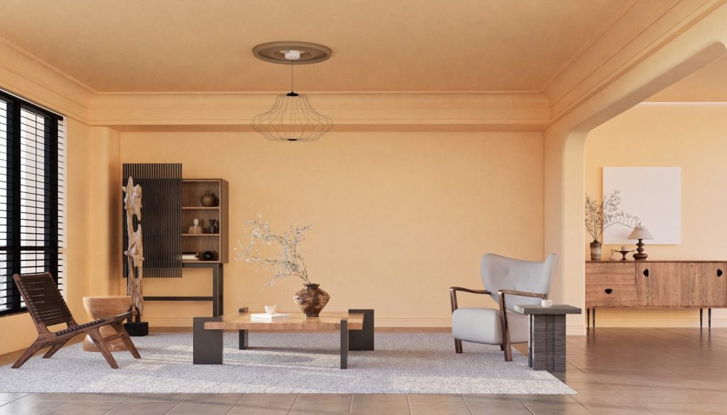
Neutral does not always mean pale. Rich colors with muted undertones can create warmth and sophistication while still acting like a flexible background for artwork and furniture.
Deep choices such as Gentleman’s Gray or Newburg Green add personality without overwhelming a room. They also pair beautifully with wood accents and metallic finishes.
Keep One Neutral Flowing Through the House
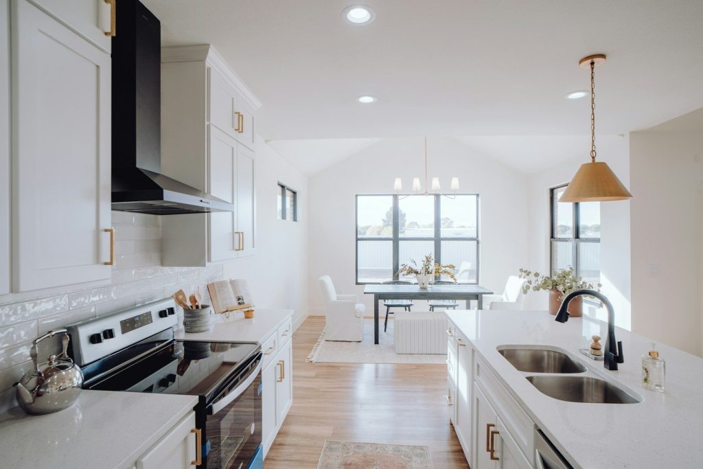
Using a consistent neutral in connected spaces creates a smoother visual transition from room to room. The home feels larger because your eyes are not constantly adjusting to dramatic color changes.
You can still introduce personality through textiles, artwork, rugs, and accessories while letting the walls provide a calm foundation that never competes for attention.
Look Beyond Plain White
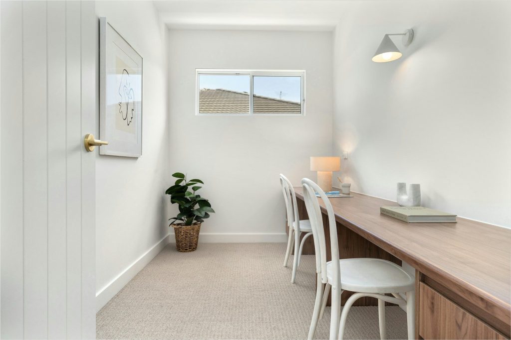
A soft neutral with subtle undertones often delivers more depth than a bright white wall. The difference may seem small on a paint chip but becomes obvious across an entire room.
Colors like Simply White or Old Blue Jeans offer gentle character while staying versatile enough for changing decor over the years.
Test Paint Where It Matters Most
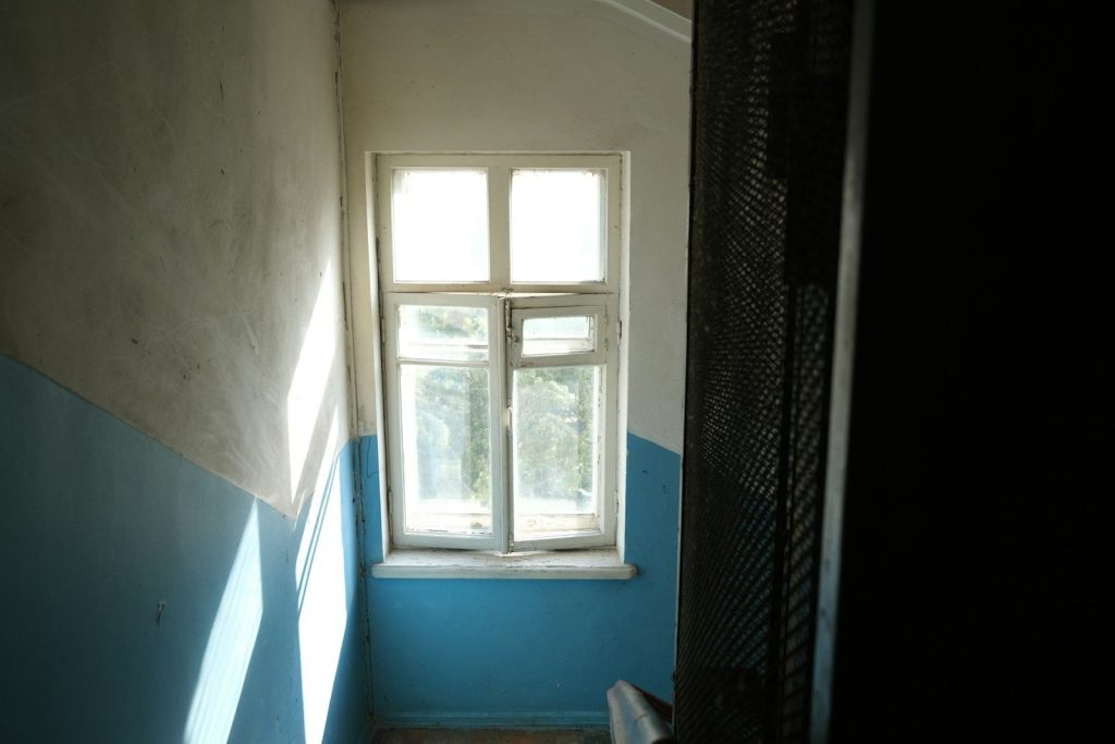
Paint samples near windows, corners, and trim instead of only in one central spot. Every wall receives light differently, and seeing those differences prevents unpleasant surprises later.
Moving around the room throughout the day gives you a much clearer picture of how the final result will actually feel once the entire space is painted.
Choose Timeless Over Trendy
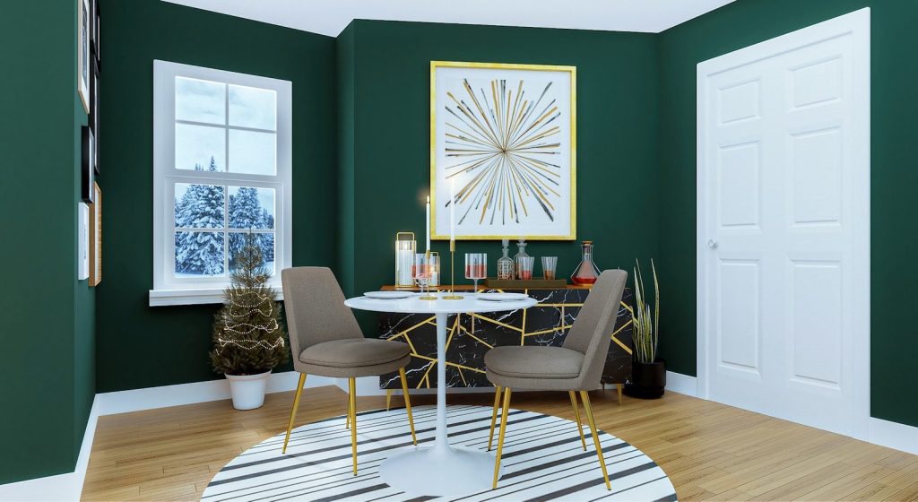
The smartest decorating hack is selecting colors that still look good after furniture, artwork, and seasonal decor change. A dependable neutral gives you endless flexibility without constant repainting.
Designer favorites stay popular because they adapt to different styles instead of dominating them. Choosing versatility first often saves money and keeps your home looking current for years.
Featured Image: By Lisa Anna on Unsplash